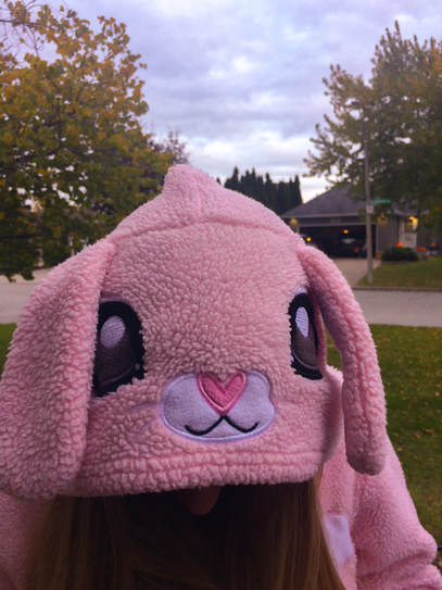
Our assignment this past weekend was Halloween. I took this picture of my friend Karissa wearing her bunny costume. I used this picture to represent the different costumes people wear on Halloween. When I originally uploaded this photo it was very dark and under exposed so to fix this I first white balanced the photo and turned up the temperature to +20 and the tint to +33. I then turned up the exposure to +50 to really bring out the background. I also turned the highlights down to -70 as the sky was very very overexposed compared to the rest of the photo, when I turned it down it gave the clouds colour and shape. I also brought up the whites to +40 to bring out the nose and eyes on the bunny's face. I also brought up the vibrance to +31 and saturation to +24 to make the bright colours pop.
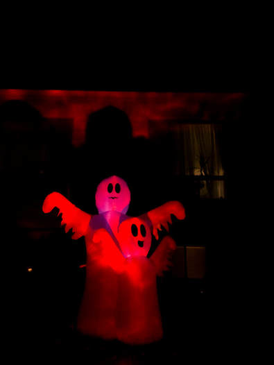
In the original copy of this photo the ghosts were a little bit too dark. To fix this I first lens corrected and white balanced. I then turned the tint up to +55 to really bring out the red. Next I brought up the temperature to +45. I then brought up the exposure up to +25 and constrast up to +38 to make the red stand out from the dark background. Next I brought the shadows down to -41 to make the ghosts shadow on the house pop. I also brought up the whites to +20 and the blacks down to -35. To finally make the red more vibrant I slightly turned up the vibrancy and saturation. I chose this photo because it represents all the spooky things in the Halloween season.
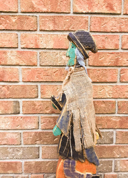
For this picture I brought outside this witch statue decoration and put it against orange bricks. In this photo the orange bricks were originally very dull. My goal when editing this photo was to make the wall more vibrant and to pop more. To achieve this look I first white balanced and cropped a bit from the right side so the witch wasn't exactly in the centre. After that I turned the temp up to +24 to bring out warm tones. I also brought up the tint to +30. I slightly turned up the exposure and contrast to make diffrent colours pop off one another. I brought up the black to +10 to bring out the witches hat and other black details against the brick. Finally I brought up the vibrancy to +40 to really make any bright colour stand out.
