Sharon The Tour Poster
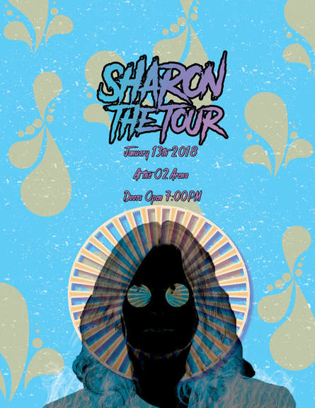
For this assignment in photoshop, we were told to create a poster for an Ozzy Osbourne tour. To begin this project, we first filled the background with a bright blue. We then took a stock photo of Ozzy and turned it into a transparent photo, using the lasso tool. After that, we used the photo layering difference to change the colour of Ozzy. We then made a new layer and put a shape on top of his face and coloured it orange to compliment the blue background. We added a drop shadow and coloured it a subtle pink to create depth on his halo. Next we used the brush tool to get the cool orange shapes spread throughout the poster. It gave the poster more detail while keeping it subtle. We also added a speckle paintbrush layer to make the poster look vintage. The final paintbrush we used was a smoke brush to create the white smoke pattern on his jacket at the bottom. Finally, we added text to show the tour name. We decided to name the tour "Sharon The Tour" after an expression from a Disney Channel show. The font was chosen off of a font website from the horror section, but to us it gave a rock vibe. We customized the gradient of the text using pinks, blues, and purples. We selected the gradient to be linear and added a stroke outline to make the title pop out.
Ryan
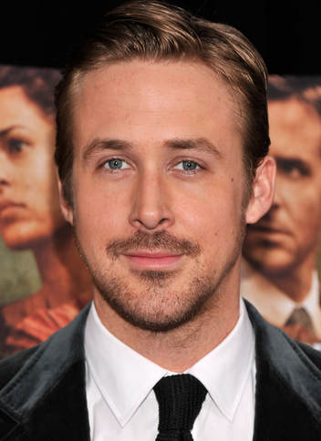
|
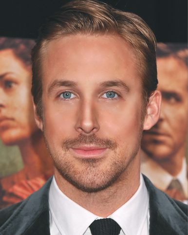
|
We took a stock image of Ryan Gosling and used photoshop to enhance his image so he's ready for any magazines or features. First, we resized the image so it fit the paper with the fill button. Then we made a duplicate copy of the original and wanted to create more symmetry in his face to appear more attractive (if that's even possible). We used the circular marquee tool to select his left eye (it was more attractive) and selected via copy. It duplicated the space of the eye that we selected, so then we flipped the eye and moved it over the right to make both eyes symmetrical. We then used the eraser tool with a brush that had faded edges to erase and blend the harsh lines with the rest of Ryan's face. We repeated this step with his nose using the left side, his eyebrow with the left side and his mouth using the right side. It achieved the symmetry that we wanted. After blending all the harsh lines out, we then did a skin edit on Ryan's face. After adding another layer we used the heal tool with an opaque brush to remove any unwanted blemishes such as pimples, moles, scars, and blackheads. Next, we used the mask feature, we filled the added layer with black and used the white brush. We used the blur filter on him, and by using the white brush we were able to uncover the blur and improve the look of his forehead, nose, chin, and cheeks, (white reveals, black conceals). By doing this it created an even base. At this point his skin was near perfect. But, his features needed some improvement so we created another layer labeled liquify. We used the liquify filter to widen his eyes, plump his lips, slim his nose, and slim his face. After, we did an eye edit. We created another layer and colourized it to a light, yet natural hue of blue. Once again we used the mask tool (white reveals, black conceals), filled the layer with black and used the white brush to reveal his new eye colour. Sometimes if we made mistakes we would use the erase brush. Lastly, his skin was looking a bit washed out and dull so we created a contour and highlight layer, filling the layer with grey. We then selected the blend mode to soft light and then proceeded. We used the burn tool at a very translucent percentage to not go overboard and a brush with a lot of feather. His cheeks, forehead, and nose were contoured, and the pupil of his eyes were darkened with the burn tool. Then, we used the dodge tool and highlighted his cheekbones, middle of his nose, cupids bow, shine on his lips, brow bone, and the highlights in his hair. Lastly, we merged all layers together and created an editorial-model-in-vogue edition of Ryan Gosling.
Shoe Ad Inspiration
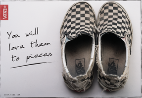
I chose this ad because I thought it was very simple yet effective. I liked how the colour scheme was limited an how the shades worked well together. I think this ad is very effective to people reding this in a magazine because they will be convinced that the shoes are maybe comfortable. This is because the shoes in the ad are shown in a form that they would have been worn and excessive amount for them to be that torn up and worn out. The ad also saying "you will love them to pieces" help to convince the reader that they should go buy the shoes.
|
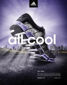
To me this ad was very pleasing to the eye, it is both subtle and eye catching at the same time. I enjoy how it says "all cool" and to represent that the ad designer used a light brush effect to make it look like cool air is coming from the shoes, this is very effective as the reader will think the shoes will keep your feet cool while wearing them. This ad is also effective because they used the same colours in the shoes and background which means, to me, the ad isn't too overwhelming.
|
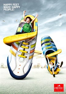
I chose this ad because it made me happy to look at it. It is showing that kids will enjoy these shoes and they will have fun, the fun in this ad is represented by the slide that is photoshopped into the shoe. This ad is probably the most effective to me because there is a dark sky. Usually a dark, cloudy, rainy sky would make people a little sad and under the weather. But this ad represents that even on a gloomy day these shoes can make you feet happy which can make a person happy.
|
Shoe Print Ad
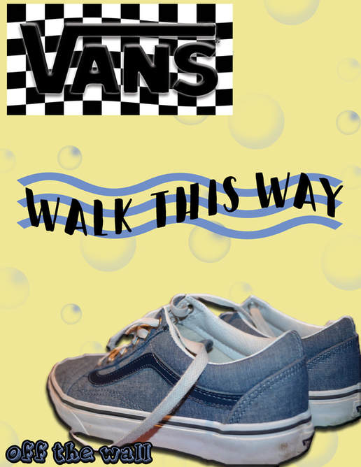
For my shoe print ad I took an image of my old Skool vans. My goal for this ad was to make it simple yet eye catching. To accomplish this I first took the original shoe image and made it a png by using the quick select tool. Next I pasted it onto my document and angled and sized it to how I liked it. To contrast with the shoes I used a pastel yellow background and added light blue bubbles. To add more detail to the shoes I added a drop shadow and bevel and embossed it to make it seem like its natural in the background. I then downloaded a font and curved it to go opposite to my wavy sticker., I came up with the slogan "walk this was". I then took a checkered image and placed a vans logo on top of it. I beveled and embossed the vans logo to make it seem like it was a natural part of the checkered photo. Finally, along with the slogan I came up with I used the vans slogan "off the wall" which is in the bottom left corner. I added a drop shadow to this to add detail.
Dog Multi-Layer Image
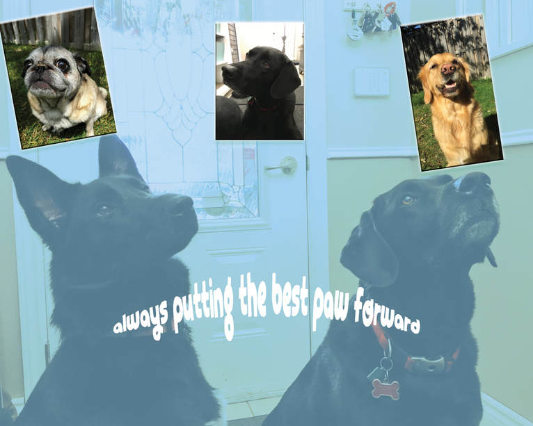
For this assignment on photoshop, our goal was to make a mulit-layered image with the photos of our pets from the previous shooting assignment. To accomplish this final product I first put the photo of the to dogs as the background. Then I changed my blend mode to soft light and turned the opacity down so you could see more of the colours and details. I then placed 3 photos I took of other dogs and changed the effects with those. I bevel and embossed them and added a drop shadow, I then added a very slight stroke to make them look like they pop out. Finally, I added the text saying "always putting the best paw forward". I went on Dafont and downloaded the font Pentague. To give is an arch effect I chose it from the warp option.
